- 8
- columns Width of the widget grid
- 24 months
- of history Default retention, adjustable
- 4
- languages Interface languages
- 30 days
- trial All except the HA add-on
Can I build the dashboard view myself?
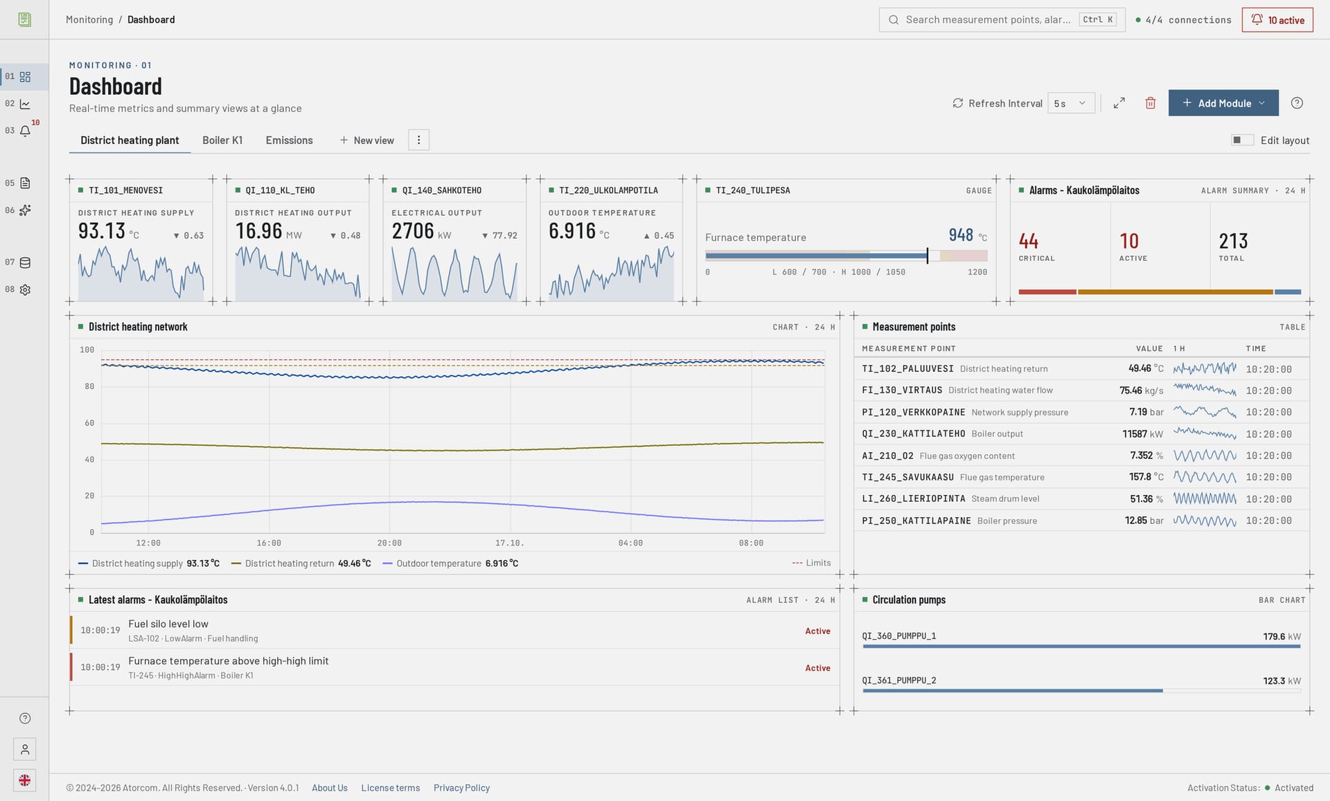
Yes. A dashboard is built in the browser on an 8-column widget grid: a widget is dragged to the place you want and resized from any edge or corner. Placement is free, that is, the grid does not force widgets into ready-made slots. Making a view requires no code and no separate tool, and the same view works on a desktop and on a control room touchscreen.
In detail: where a widget gets its data
The work goes one widget at a time: you add a widget, choose a measurement point for it and drag it to the size you want. Any measurement point already being collected can be a widget's source. The points come over the OPC UA connection to the automation system and are managed in a view of their own, so on the dashboard you only decide which part of the collected data is shown.
What widgets can be added to the grid?
Gauges, charts, value cards, data tables, bar charts and alarm widgets are added to the grid. The same dashboard can therefore combine an instantaneous process value, the curve of that same value and a list in table form. Charts are drawn by ECharts in the browser without add-ons. All the widgets read the same database, so views cannot drift onto different figures.
Widget types and what each one shows
| Widget | Shows |
|---|---|
| Gauge | The value of a single measurement point on a horizontal scale, with its configured warning and alarm limits marked. The reading turns orange or red when it passes a limit. |
| Chart | The curve of one or more measurement points over a chosen time range. |
| Value card | A measurement point's description, most recent value and unit, a small curve of the last hour and how much the value changed in that hour. |
| Data table | Measurement points as a table: description, most recent value, a small curve of the last hour and the time of the reading. |
| Bar chart | Measurement point values as horizontal bars, one measurement point per row. |
| Alarm list | Alarms as a list, filtered by severity and time range. |
| Alarm summary | Alarm counts for the selected time range and how they divide by severity. |
Does the view work on a control room touchscreen?
It does. The interface is a Vue 3 browser application, so the dashboard is opened at the same address from a workstation and from a control room touchscreen — nothing is installed on the workstation. Moving widgets, resizing them and saving presets work by touch exactly as they do with a mouse, so a view can be corrected in the control room itself rather than only at a design desk.
In detail: the server side and screen size
The server side stays in the plant's own network: ASP.NET Core 10.0 runs the application on its own Kestrel server, and traffic goes over HTTPS with automatic certificates.
A touchscreen does not remove the question of screen size: a control room wall display deserves a sparser view of its own than an engineer's two monitors. Thanks to presets, both can live side by side.
How are historical trends examined?
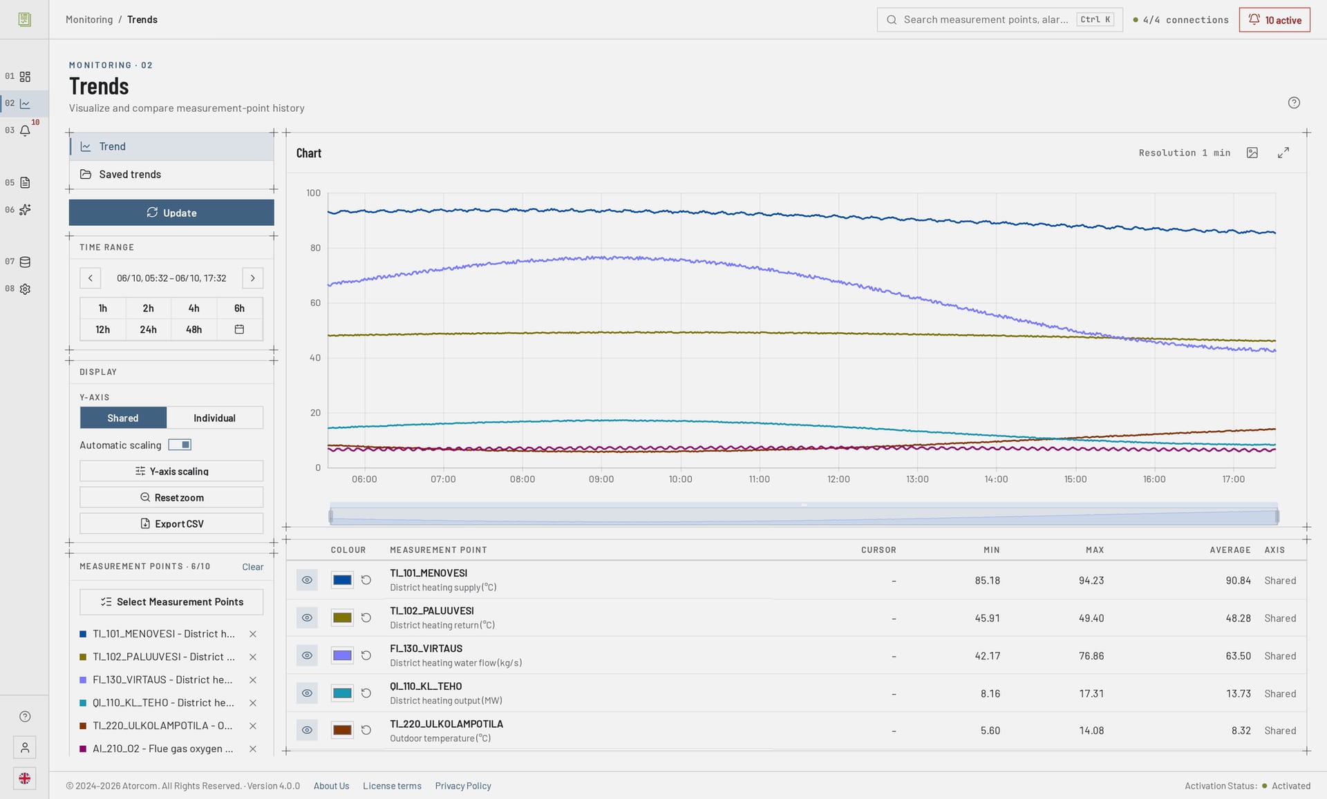
In the trend view you choose the measurement points and the time range, after which the chart is zoomed directly with the mouse or by touch. Each measurement point gets a colour of its own, so several curves can be read from the same chart. A finished combination of measurement points and settings is saved as a preset, which opens as it was the next time. The data is read from the same database as the reports.
In detail: where the trend data is fetched from
The data is fetched from PostgreSQL 18 with the TimescaleDB extension, which is optimised for time series. In practice the same preset serves both the morning status review and fault investigation: the time range is changed, the measurement points stay.
How do I compare two periods against each other?
The comparison is made in two ways. You can change the time range within the same preset, so that the same set of measurement points is drawn from the new period in the same colours, or you can take a report of both periods in PDF, CSV or Excel format. Calculation points convert, for example, kilowatts into kilowatt-hours according to the time range of the chosen report, so the totals are comparable.
We do not promise a direct overlay comparison of two periods in the same chart. If that is an absolute requirement, ask us about it before you buy — we will find out beforehand, and that is quicker than a disappointment at commissioning.
In detail: recurring comparison and looking for anomalies
For recurring comparison it is worth using scheduled reports: a daily, weekly or monthly report is produced on the same template every time, so the periods are bounded the same way and the comparison does not depend on where each person happened to zoom the chart. For looking for anomalies there is also a separate AI analysis, which is run on a local language model.
How far back does the trend history reach?
By default there are 24 months of history, and the retention period is adjustable to the plant's needs. The trend view reads that whole period from the same PostgreSQL 18 database, whether the time range is an hour or a year, so old data needs no separate archive and no second tool. The details of retention and automatic compression are on the OPC UA data acquisition page.
What does using the dashboard require of the server?
DataPortia is installed on the plant's own server: at least 8 GB of memory (16–32 GB recommended) and a 100 GB SSD. The supported operating systems are Windows 10/11, Windows Server 2016 or newer, and Linux (Debian, Ubuntu). The browser front end needs no separate installation on workstations.
- Authentication
- A local account or Azure AD / Microsoft Entra ID.
- Interface languages
- Finnish, English, Swedish and German.
- Data location
- On-premises installation: the collected data stays in the plant's own network.
Frequently asked questions
We have collected here the questions that come up most often about the dashboard and trend views: what has to be installed on a workstation, how a view's settings are kept, where alarms are looked at, whether the data can be taken out into another system and what happens to a view during a connection break. The answers are short, and the fuller reasoning is on the linked pages.
Does anything have to be installed on a workstation?
No. The interface is a browser application opened from the server's address over HTTPS. The installation is made on the server only.
Can the trend view settings be saved for later?
Yes. The combination of measurement points and the view settings are saved as a preset, which opens again as it was. The same applies to dashboard views.
Do alarms appear in the same view as the measurements?
They do not. Alarms are looked at in an alarm view of their own, where the original timestamp is kept unbroken to the millisecond and events are filtered by severity, area and time. The dashboard and the trends show measurement data. More: alarms and events.
Can the dashboard data be taken out into another system?
It can. REST API v1 gives read access to the same data with an API key, and events can be forwarded with webhooks. Limits and details: integrations.
What happens to the view if the connection to the automation system is broken?
In a high-availability installation the OPC UA connection moves to the standby server automatically; if the DataPortia server goes down, application-level failover takes about 15–30 seconds. More: high availability.
How do I get to try it?
The trial period lasts 30 days, includes every feature apart from the HA add-on and commits you to nothing. The installation is made on the plant's own server and the dashboard is built from the measurement points of your own process — that is when you see whether it shows what is really needed in the control room. Licences start at a 4 000 € perpetual licence, and the price scales with the number of OPC UA connections. The other parts: DataPortia overview.